Englishtown Channel, 7 x 10, watercolour, plein air Aug 28 09
So I went to Cape Breton for a week of painting classes with top notch instructors. All of them are painters famous in their own right as well as being very good at sharing their knowledge. I really learned a lot. Then I came home with my head bursting full of new painting techniques and ideas, and life got in the way of painting for a while. But now I am back at it and here is some of what came of my trip. The last day of classes was spent painting out of doors (that's what plein air means, for you non-painting people) at the Englishtown wharf. It is a lovely spot.
I painted the above sketch very quickly, just to get an idea of how to tackle the far shore of the channel and the water. Owing to the brisk wind and clouds over head the water was a fair bit darker than I am used to painting successfully. I have always had trouble, making dark water look murky, and this water was crystal clear. I wanted to do it justice. I was reasonably pleased with this sketch. I did feel that the composition was a little boring. The ferry terminal and the power poles leading out to it are a bit hard to understand if one does not know the area, so I wanted to find something more interesting and simpler to make into a painting. So then I painted the sketch below.

Englishtown Channel #2, 7 x 10, watercolour, plein air Aug 28 09
In this one (above) I am happy with how the hills in the background fade away, also with the shape of the cloud shadows on the far hills. The remainder of it could be better. The instructor, Chris Gorey, suggested to me that I include some purple in the shadows on the hills. So when I got home to my studio and finally got time to paint, I started experimenting. I tried using purple shadows a few times and eventually came up with something suitable to share. (see #5 below) I think I also fixed some of the compositional problems that were present in #2, above. I do feel that the contrast between the hills and the sky is a bit too strong. The hills could be a bit lighter and the undersides of the clouds could be darker.

Englishtown Channel #5, 10 x 14", studio, Sept 22 2009
As it was the hills and the sky and the marriage of the two that was bothering me, I decided to focus on the far hillside as I had done in my first sketch.
Englishtown Channel #6, 7 x 10", studio, Sept 25 2009
I really learned something painting the clouds in this one. I painted the dark underbellies of the clouds first instead of after around the white parts. I found that this worked really well. (though the photo I notice is a bit washed out, I will try to come back and fix it with a new photo soon) In the end, the undersides were still too light, but now I felt like I was making progress! I incorporated some purple in the hill shadows and it worked okay. In fact I am more happy with this version of the hills than in the version which follows below.
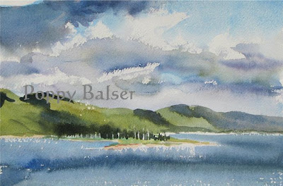
Englishtown Channel #7, 7 x 10", studio, Sept 27, 2009
It might seem that I am going too far with this subject but every now and then my scientific side speaks up and says "what if I did the same painting but changed this one thing?" So I tried to repeat #6 but make the clouds darker. Again, I painted the shadows first, and this time I painted a bit of blue around the white shapes of the clouds. I am most pleased with this sky of any of the ones in this series.
For now I am going to move on to something new, hopefully applying more lessons from Cape Breton. Stay tuned for the results! As always, I welcome comments.

What a terrific return to painting. I only wish I could do half as well with plein aire.
ReplyDeleteI very much like the last sky in your interesting series. Lovely colour range and contrast. Thank you for sharing your evolving technique with us all.
ReplyDeleteKeep it up!
Beth